STELLA - Detecting TESS Flares with CNNs

img

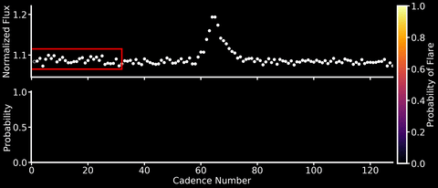
This will be both my first and last post to this blog after a short (but wonderful!) 6 months at the Flatiron Institute. So I wanted to share a machine learning project that I’ve been working over the past few months with Adina Feinstein, a PhD student at University of Chicago who many of you TESS users may already know from her Eleanor package. We’ve designed a Convolutional Neural Network (CNN) named Stella that automatically and rapidly detects flares in TESS light curves at high (99%!) precision and with minimal data preprocessing (no detrending of stellar activity signals needed!).

Neural networks are able to learn features directly from the data rather than having them hand-engineered by mere humans. CNNs are a specific type of neural network that are especially good at identifying spatial features in the data – a good thing if you’re looking for flares, which have a characteristic sharp rise and slow decline in light curves. We trained Stella on the flares identified in Gunther et al. 2020, and because the dataset was relatively small, this could be done on a laptop in about 30 minutes (no GPUs needed!). After training, Stella is able to obtain high precision (99%) and accuracy (98%) when identifying whether part of a TESS light curve contains a flare.

As shown in the animation above, we can then feed TESS light curves into this CNN “classifier” to transform it into a “detector” that outputs a sort of “flare probability time series” (where we use the term “probability” very, very loosely). Stella is also fast – it takes roughly 30 minutes to search 3500 TESS light curves for flares.

Keep an eye out for the paper presenting Stella and its application to some cool science cases in the coming months. As for now, feel free to check out the code on Github and send us any feedback (if you’re lucky you may get one of the sweet stickers we made with the Stella logo designed by Adina).

Occultations in reflected light

img

I’ve been working on the problem of computing occultation light curves of planets and moons in reflected light. This is an extension of my starry code to the case where the specific intensity on the surface of the body is zero beyond the day/night terminator. To compute the light curve of an occultation event like that shown in the figure, we need to integrate the specific intensity of the body over the portion of the dayside hemisphere that is facing the observer and not obscured by the occultor. It’s often easier to compute the occulted flux and subtract that from the total flux; the former is given by the integral over the region that is shaded in blue. In the original starry paper, I showed how this integral can be computed analytically in the case of thermal (emitted) light if we use Green’s theorem to transform it into a line integral along the boundary of the region. In the case of reflected light, the integral is still analytic, but harder because of the presence of the terminator. The tricky part is determining all of the integration paths (P1, Q, P2, and T) and endpoints (alpha, beta, gamma, delta). The terminator is always a segment of an ellipse, so we need to figure out how to programmatically identify all the points of intersection and traverse all of the segments that make up the boundary (of which there can be anywhere from two to five). This is proving to be tricky, since there are lots of different ways that two circles and an ellipse can intersect. But the end is in sight, and I hope to make this functionality available in starry in the next month or so.

This will hopefully have applications to modeling secondary eclipse (planet) light curves in the optical, occultations of Solar System bodies (such as mutual occultations of the Galilean moons), planet-planet occultations with JWST, and some day perhaps even exoplanet-exomoon occultations.

Turbulence Statistics

img

The sites of star formation are self-gravitating, supersonic, magnetized turbulent clouds. These clouds are riddled with small-scale structure - clumps, filaments, and shocks - which undoubtedly play a role in how stars form. To understand these structures a bit better, my collaborator Nia Imara (Harvard) and I have been thinking about statistics we might use to characterize them!

Inspired by the Zel’dovich approximation, used to describe structure formation in cosmology as a succession of gravitational collapse into sheets, filaments, and halos or clusters, we’ve been exploring the following space. At each point in a turbulent box simulation, we compute the Hessian matrix, composed of all the second spatial derivatives of the density. This matrix describes the curvature of the density. We then compute the eigenvalues of this matrix, which each correspond to the size of the curvature in one of the three spatial dimensions, though in coordinates that are not necessarily aligned with x, y, and z.

In this space of eigenvalues, “clumps” should be found where all three eigenvalues are large and negative, while “filaments” only need two eigenvalues to be large and negative (the third should be small), and “sheets” should have one large, and two small eigenvalues. This space of eigenvalues is shown in the animation, where each frame corresponds to a different smoothing scale for the density. In this particular simulation, there is remarkably little mass that clearly resides in any of these categories. Instead, it occupies a range of values right in the middle! There is also a good deal of mass where the second eigenvalue has a sizable positive value, corresponding to thin structures where the density oscillates up and down along the structure. It remains to be seen how this distribution will be affected by changing the inputs of the simulation, but it could be that the nomenclature and interpretation around these small-scale structures could use some revision.

Data viz, meeting design, and other science

img

Hello again, world! We (the data group) have been slightly deliquent with this blog lately, but our collective New Year’s Resolution is to post more. (Not really, I just made that up. But here’s hoping!) This particular post is going to be fairly meta, because coming back to the blog after a break seems like a natural opportunity to reflect a bit.

In the last couple of months we made some changes to the format of our weekly group meetings. Figuring out how to run a good meeting is a hard job, especially when the goal of your meeting is measured less in productivity and more in culture. We want the group meeting to feel like a community event where everyone has an equal opportunity to get the feedback and support they want, and there’s no atmosphere of judgement or power hierarchy. In my experience, all the other good stuff (lively science discussions, new ideas, increased understanding of other group members’ research) arises naturally under those conditions. This is a hard thing to control, and it’s gotten trickier as our group has gotten bigger! Recently we had to move to a bigger room, and the usual “60 or 90 minutes divided by number of people in the room” time allotment was leaving many people without enough time to get the feedback they wanted from the group.

Our new group meeting format is similar to the old one in that everyone gets a chance to share something (a figure, an idea, a piece of text, etc), but we made a few tweaks. We are now using Google Slides, which is an improvement because (a.) it cuts down dramatically on the time spent fumbling with HDMI and AirPlay when everything can be shown from one laptop, and (b.) each meeting leaves a record, which is nice to reflect on sometimes and allows group members who aren’t at the meeting to see what happened. We are also shifting away from the requirement that every group member should attend and present at every meeting; this hasn’t really changed attendence in practice, but I think it helps the general tone when we all know that everyone in the room is there because they want to be. Finally, regardless of how many people attend, each person gets 10 minutes to speak. If we run out of time, those who didn’t get a chance to show their slide get bumped to the beginning of next meeting’s slide deck. Overall this format seems to be working well, but I’m sure we’ll continue to experiment.

All that being said, here’s my slide from last week’s meeting! I wanted to spark a discussion on data visualization and particularly the representation of uncertainties, with the example of an exoplanet mass-radius diagram that I drafted up for a paper. Mass-radius diagrams are tricky because the objects that naturally take up the most ink and catch the viewer’s eye are the most uncertain measurements, which actually contain the least information. So how to make sure that the viewer gets a quick, intuitive sense of what we really know about exoplanet properties? My favorite example of this in the literature from Zach Berta-Thompson’s 2015 paper is shown on the left. He scales the opacity of the points with their relative uncertainties, which is a clever way around this problem. I actually liked this plot so much that I made an interactive version of it in Bokeh for fun a while back! On the right is my mock-up of more of a “contour plot” approach, which solves my pet peeve of having disembodied error bars creeping in at the edges of the plot, and I think conveys the uncertainties better. I like that the overlapping transparent shapes give more weighting to the regions of parameter space that are covered by more planets, and I think this is a good way to go when what I’m trying to convey is more about the population than about individual planets. Next step is to scale ellipse transparencies with their areas!

Stellar streams around the Milky Way in the Legacy Surveys imaging data

img

The stellar halo of the Milky Way is full of debris streams — “stellar streams” — left over from dwarf galaxies and globular clusters that have been destroyed by our Galaxy’s gravitational field. These structures are diffuse, distant, and much lower density than foreground stars in, e.g., the Milky Way disk, which is why they don’t appear if you just plot the sky positions of all stars from a photometric survey like the SDSS or Pan-STARRS. One way to search for and enhance the significance of stellar streams is to filter photometric data using templates constructed from isochrones of stellar populations that have characteristics similar to the typical objects that we think disrupt to form the streams (typically low metallicity and old). By moving these color-magnitude filters in distance or distance modulus, we can then construct density maps of the sky positions of these filtered stars to look for linear features that persist or appear consistent between different distance slices. This has been done in the past using, e.g., the northern SDSS data, the full SDSS footprint, and Pan-STARRS.

This week, Nora Shipp (Chicago; who found most of the known streams in the southern sky) has been visiting the CCA to search for new streams, and confirm the existence of stream candidates, using data from the DESI Imaging Legacy Surveys. This survey is deeper and higher resolution than the SDSS, so we are hoping we will find some interesting new things. So far, we have produced filtered sky-maps in distance slices, and are beginning to correlate structures in our new maps with past surveys and discoveries.

One way of visualizing the data is to produce a “field of streams” map, by assigning density in different distance slices to different color channels. In the sky map figure shown above (in equatorial coordinates), the intensity of each pixel is related to the number of stars that pass our color-magnitude filter, and the color of each pixel is an indication of the mean distance of stars in that pixel. In this case, red pixels are ~20–60 kpc from the sun, green is ~10–20 kpc, and blue is ~5–10 kpc. Already with this map, we can see many of the known prominent streams in the northern and southern hemispheres (the widest and most prominent being the Sagittarius stream). Now that we have pretty images, we have to buckle down and try to characterize individual features!

Made-to-Measure modelling

img 
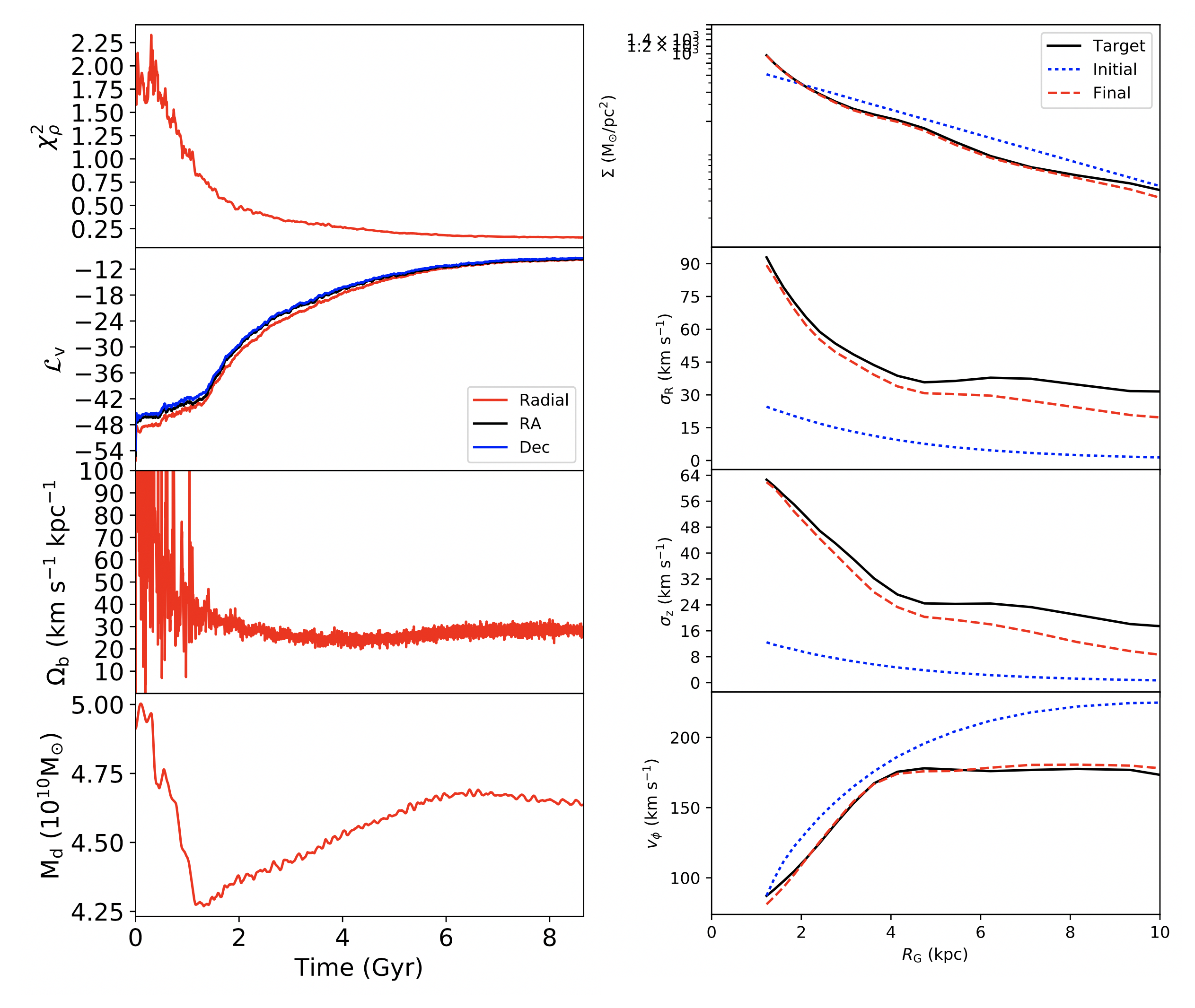
As a new Flatiron Research Fellow who stared a few weeks ago, most of my time here so far has been taken up with getting myself set up in a new institute, and a new country. But, I’ve also had time to continue some of my thesis work from a few years ago now, which involves using the Made-to-Measure (M2M; Syer & Tremaine 1996) technique to tailor galaxy simulations to match data. Or in this case, fake data.

With M2M, you start with some particle model of the desired galaxy, and then slowly alter the weights of the model particles in order to better represent the target system, while also letting the particles orbit in the galactic potential. While the traditional M2M algorithm runs on a ‘test particle’ system, where the gravitational potential is fixed and known, my algorithm PRIMAL runs on a live N-body model, where the gravity is calculated from the interaction of the particles themselves. So, because we change the particle masses, the potential also changes, and can theoretically be recovered. During my PhD I showed that PRIMAL can recover a simple galaxy model, from mock data constructed with a selection function based on the European Space Agency’s Gaia mission (Hunt & Kawata 2014), with the goal of applying PRIMAL to actual data from Gaia to create a new model of the Milky Way.

However, this previous galaxy model was relatively smooth, with only the galactic bar for non-axisymmetric structure. In reality the Milky Way has significant disequilibria features in both the positions and motions of the stars, some of which are likely owing to the interaction with satellite galaxies. So far it remains an open question how well PRIMAL (or M2M in general) can recover such features. As an initial test of this I am applying PRIMAL to a galaxy from the Auriga cosmological simulation, which formed through a series of mergers and is a more realistic target. The modeling is ongoing, and in the Figures here you can see the progress part way through the simulation. The left plot shows the time evolution of the density fit (upper panel), the kinematic fit in all three dimensions (2nd panel), the bar rotation speed (third panel) and the disc mass (lower panel). The right hand panel shows the radial profiles of the surface density (upper panel), the radial velocity dispersion (2nd panel), the vertical velocity dispersion (third panel) and the mean rotation velocity (lower panel), for the initial model (blue dotted line), the target data (black line) and the current state of the model (red dashed line). The model is now a considerably better fit to the target data than the initial model, but it is still converging and I won’t know how well we’ve done for another week or so.

Giant planets orbiting giant stars with TESS

img

Along with starting at the Museum last month, I also kicked off a search for (large, so probably gaseous) planets orbiting low luminosity (3-10 Rsun) red giant branch stars with TESS. First, I used MAST to create a target catalog of stars using TICv8 stellar parameters, making cuts on stellar radius and temperature which left me with ~40,000 TESS targets. I then used the eleanor pipeline in order to download individual sectors of data of targets that were in TESS sectors 1 and 2. From there, I set up a “quicklook” pipeline to turn these lightcurves into plots, where I can look for key features in the data to identify high priority targets for ground-based followup RV observations. The two key features I’ve been looking for are planet transits in the lightcurve, as well as stellar granulation and oscillation features in the Fourier transform of the lightcurve. Combining these features, I can precisely characterize the stellar mass and radius, and planet candidate radius in the system, which I will combine with RV measurements to confirm planets and measure their masses and eccentricities when possible.

The plot I’ve attached is the output of a “quicklook” plot for a particularly interesting target. The upper left hand panel represents the four lightcurves that eleanor outputs–a raw lightcurve, a corrected lightcurve, a lightcurve constructed using principal component analysis, and a lightcurve made using a set PSF model. The panel below it is the corrected lightcurve which has also undergone outlier rejection and has been smoothed by a 2-day median filter. Below that is the power in a BLS search as a function of period in this lightcurve, where the peak has been highlighted in a blue band. The bottom left plot is the corrected lightcurve, folded at the best-fit BLS period. This is where I look for a clear, phase-folded transit. The right panel is the Fourier transform of the lightcurve in the second left panel. Here, the features of interest are a slope corresponding to higher power at low frequencies, indicative of stellar granulation (or other red noise features), or a “triangular picket fence” of frequencies which are evenly spaced at a particular pattern, which correspond to solar-like oscillations in these giant stars.

On the left hand side of this figure, you can see a transit-like feature which has been identified by the BLS search. The duration and shape of this figure would be consistent with a Jupiter-sized planet transiting an evolved star. On the right, a slope from low power to high indicates a potential granulation noise signal. Furthermore, a bump in the Fourier spectrum is visible around 200 microHertz, which could potentially correspond to stellar oscillations that would indicate a 3-4 Rsun radius for this star. However, this power excess is a little too noisy to do proper asteroseismology. Luckily, this was a CVZ target, and thus we could combine 12 sectors of observations, which showed that the planet transit is real, but the oscillation bump is not. Now to search tens of thousands more lightcurves for a candidate with both asteroseismic and transit signals!

Removing HST Systematics based on Our Knowledge of K2 Systematics

This week, Rodrigo and I have been working on using our knowledge on removing instrument systematics from Kepler to better understand how to remove instrument systematics from HST. In my research I use HST’s Wide Field Camera 3 to observe transiting exoplanets in the infrared, and use the spectrum to try to identify water in the upper atmospheres of planets. This is a tall order, seeing as the signals we are looking for are <200ppm, and the instrument systematics can easily introduce correlated noise at the 0.1% level. Because of these large instrument systematics, it can be hard to trust small water detections. To address this, we’re interested in removing instrument systematics from HST data in a more bayesian and principled way. Rodrigo and Dan have both been teaching me a lot about how to do this!

The “figure” I’m including is a movie of the frames from HST observations of HD209458b. The spectrum of the object has been scanned up the detector over the course of ~20 seconds, and then a new image is taken during the course of the transit. There are several systematic effects making this data imperfect. The scan rate is not exactly even, causing there to be a “wave” pattern during the scan going up the detector. There is a geometric distortion which causes the dispersion to be slightly tilted in the x and y axis. The flat field for these pixels hasn’t been removed, and there is clear structure that is unrelated to the observation. Finally, over the course of the transit many of these images are taken, and they are not perfectly registered, causing a drift over time. All of these effects add up to a large systematic component.

This week Rodrigo and I have used similar techniques to his PLD pipeline to iteratively fit for the stellar spectrum and the instrument effects. We are able to fit out the distortions, pixel flat field and image registration errors, and find a transmission spectrum that is consistent with the literature spectrum. Our next steps are to ensure that we are not over fitting, and add in sampling so that we can find robust errors on the spectrum, marginalizing over the instrument systematics. Watch this space!

Fitting single transits

img

Shortly before group meeting, I asked Twitter what I should work on today (see above). But, working on writing the paper is much less fun than thinking about new features so I went through a derivation of the right “priors” to use when characterizing a single transit. I have previously published on this topic (as have many others!) and the basic idea is that even if you only detect a single transit you can place some constraint on the orbital period because the duration of the transit is informative. This constraint on the period tends to be weak because the transit duration is covariant with all of the properties of the system (especially eccentricity, impact parameter, and stellar density). Recently, David Kipping pointed out that the fact that the planet transits is a useful datum when fitting a system like this. However, the full story of how this information can be included in the fit of a single transit is slightly more complicated than presented in that note. So at group meeting I shared my derivation and got some feedback about how to present it clearly. The main argument is that you want to make inferences about p(parameters | light curve, the planet transits) instead of just p(parameters | light curve). Then since the light curve and the fact that the planet transits are conditionally independent (given the parameters of the system), the joint probability factors as p(parameters) p(light curve, the planet transits | parameters) = p(parameters) p(the planet transits | parameters) p(light curve | parameters) and p(parameters) p(the planet transits | parameters) looks like a “prior”, but it isn’t separable (it correlates the orbital period with all the other parameters). This argument could also be applied to systems with more than one observed transit, but it looks like the effect would be negligible in most cases. Stay tuned for a tutorial with more details!

Finding Anomalies in Galaxy Surveys

img

I have been working on a new method for detecting anomalies in astronomical images with deep learning, with Marc Huertas-Company (Observatoire de Paris) and Alexie Leauthaud (UCSC). The idea is to use unsupervised learning to pick out potentially interesting (or “anomalous”) objects in galaxy surveys, as there is way too much data to look through by hand; the lack of supervision also means we can find interesting things we may not know to look for. I first trained a Generative Adversarial Network (GAN) to generate fake images that are similar to the real images in the survey. This “generator” will learn what the objects look like and their distribution. It will do a good job reconstructing images like those that are more common in the survey, and it will be worse at generating the more “anomalous” images.

The top set of images shows a random sample of objects. The first row is the real image, the second is the generator’s attempt at reconstructing it, and the third is the residual. The generator does a pretty solid job on the common blob-like galaxies. It has a harder time with the rarer, more extended objects (and the background noise). I let the generator try to reconstruct a million objects from the Hyper Suprime-Cam survey. Based on these residuals (and other features), I assigned each object an “anomaly score.” The plot shows the distribution of scores for all million objects; you can see a longer tail of high-anomaly-score objects, as there are more ways to be anomalous than to be normal.

I then make a cut to get the top-scoring objects, and performed some clustering on these. The bottom sets of images show a random selection of objects for four of these clusters, each labeled with its anomaly score. You can see that not only have we found more anomalous objects (these look qualitatively different than the random set), but we have also organized them a bit to help us identify truly interesting anomalies. The GAN identifies anomalies in both morphology and color. Some of the anomalies are bad detections (e.g. red cluster, 2nd and 4th columns) or empty images (greenish cluster, 3rd and 4th columns). But the last group definitely contains some interesting objects! The far right image is a galaxy with a strong tidal feature, which is interesting for galaxy formation studies. So far we have identified multiple galaxies with tidal features as well as some potential AGN; we hope to find other interesting objects, such as green-pea galaxies or even strongly lensed systems.

Up next is improving my GAN and clustering methods to better sort out the anomalies, and continuing to validate our method by cross-correlating our anomaly catalog with known interesting objects and pipeline errors.