Hello again, world! We (the data group) have been slightly deliquent with this blog lately, but our collective New Year’s Resolution is to post more. (Not really, I just made that up. But here’s hoping!) This particular post is going to be fairly meta, because coming back to the blog after a break seems like a natural opportunity to reflect a bit.
In the last couple of months we made some changes to the format of our weekly group meetings. Figuring out how to run a good meeting is a hard job, especially when the goal of your meeting is measured less in productivity and more in culture. We want the group meeting to feel like a community event where everyone has an equal opportunity to get the feedback and support they want, and there’s no atmosphere of judgement or power hierarchy. In my experience, all the other good stuff (lively science discussions, new ideas, increased understanding of other group members’ research) arises naturally under those conditions. This is a hard thing to control, and it’s gotten trickier as our group has gotten bigger! Recently we had to move to a bigger room, and the usual “60 or 90 minutes divided by number of people in the room” time allotment was leaving many people without enough time to get the feedback they wanted from the group.
Our new group meeting format is similar to the old one in that everyone gets a chance to share something (a figure, an idea, a piece of text, etc), but we made a few tweaks. We are now using Google Slides, which is an improvement because (a.) it cuts down dramatically on the time spent fumbling with HDMI and AirPlay when everything can be shown from one laptop, and (b.) each meeting leaves a record, which is nice to reflect on sometimes and allows group members who aren’t at the meeting to see what happened. We are also shifting away from the requirement that every group member should attend and present at every meeting; this hasn’t really changed attendence in practice, but I think it helps the general tone when we all know that everyone in the room is there because they want to be. Finally, regardless of how many people attend, each person gets 10 minutes to speak. If we run out of time, those who didn’t get a chance to show their slide get bumped to the beginning of next meeting’s slide deck. Overall this format seems to be working well, but I’m sure we’ll continue to experiment.
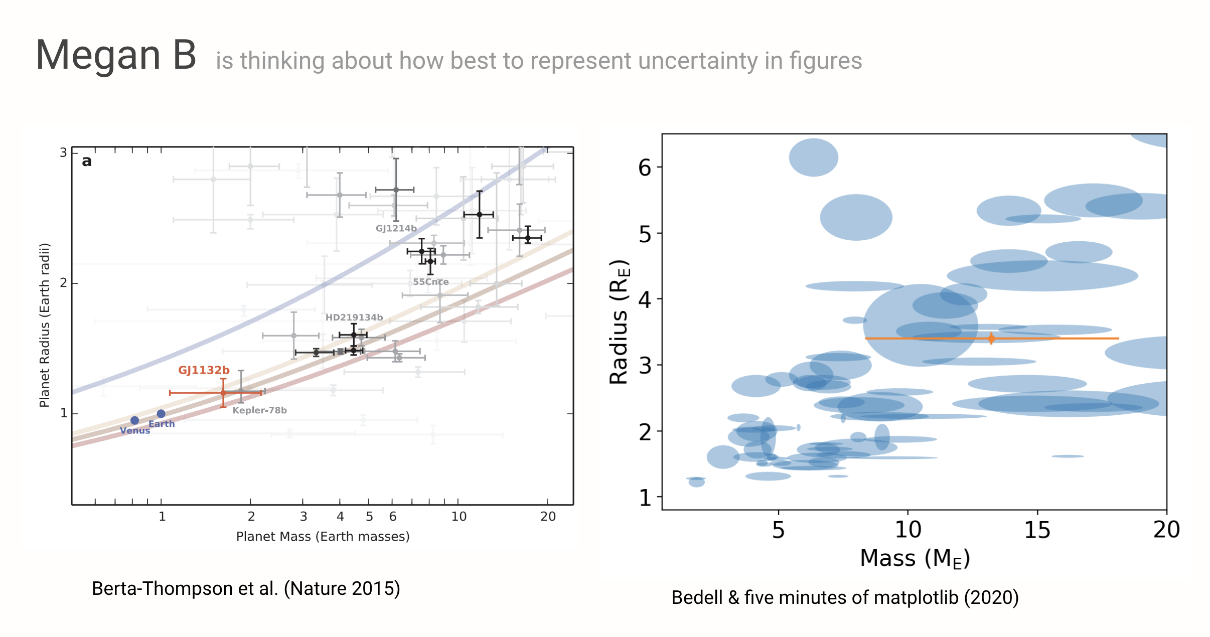
All that being said, here’s my slide from last week’s meeting! I wanted to spark a discussion on data visualization and particularly the representation of uncertainties, with the example of an exoplanet mass-radius diagram that I drafted up for a paper. Mass-radius diagrams are tricky because the objects that naturally take up the most ink and catch the viewer’s eye are the most uncertain measurements, which actually contain the least information. So how to make sure that the viewer gets a quick, intuitive sense of what we really know about exoplanet properties? My favorite example of this in the literature from Zach Berta-Thompson’s 2015 paper is shown on the left. He scales the opacity of the points with their relative uncertainties, which is a clever way around this problem. I actually liked this plot so much that I made an interactive version of it in Bokeh for fun a while back! On the right is my mock-up of more of a “contour plot” approach, which solves my pet peeve of having disembodied error bars creeping in at the edges of the plot, and I think conveys the uncertainties better. I like that the overlapping transparent shapes give more weighting to the regions of parameter space that are covered by more planets, and I think this is a good way to go when what I’m trying to convey is more about the population than about individual planets. Next step is to scale ellipse transparencies with their areas!