The Transition Redshift

img

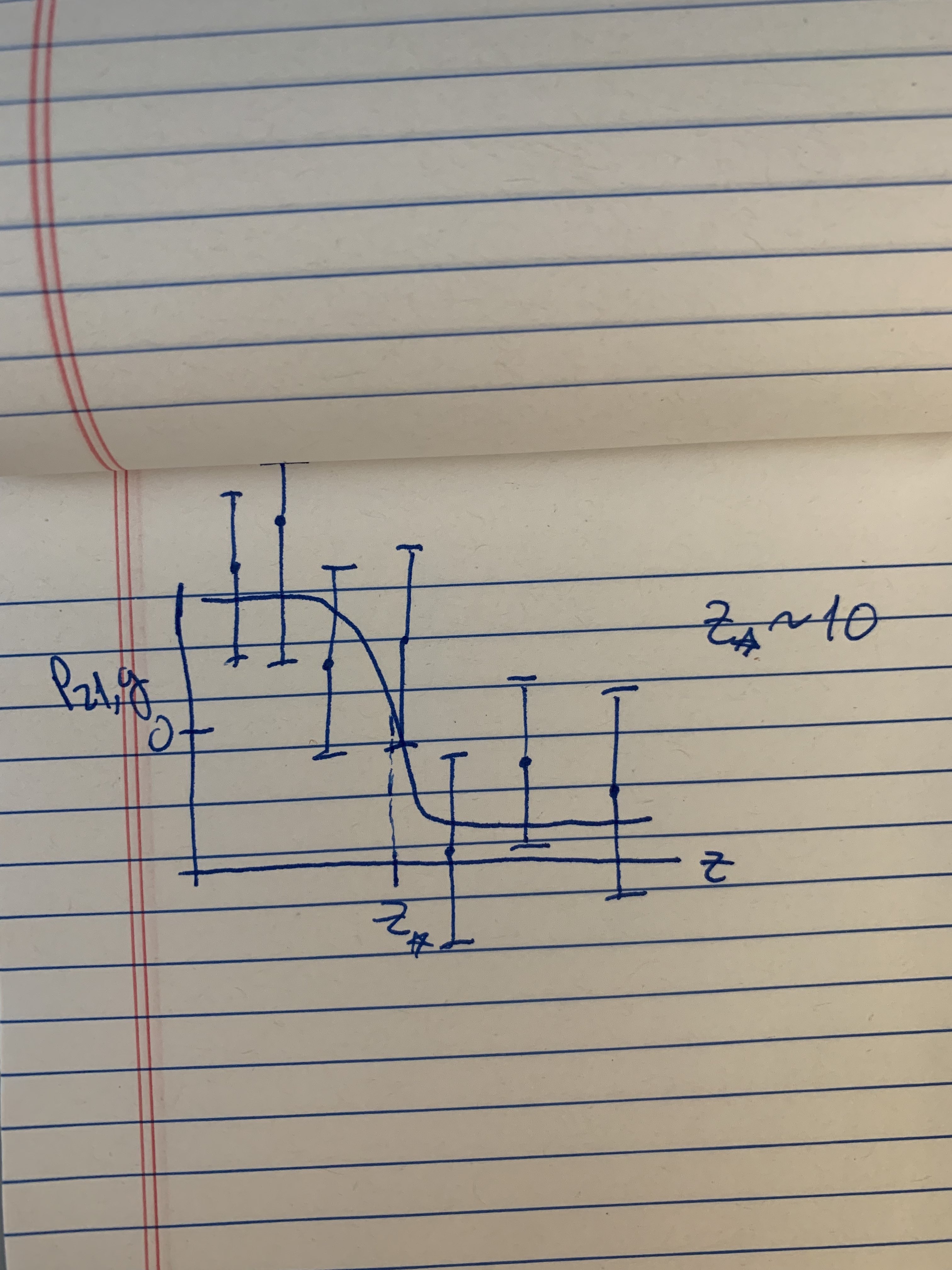
I’m working on a short reionization project where we want to figure out where a function crosses zero. I’ll spare the details of what this function (P21,g) is for the bottom of this post. But suffice it to say that the redshift where it transitions from being positive to negative (the “transition redshift”) is an interesting quantity. The plot shows a sketch of what the data might look like - where the function itself is not measured but the data still constrai

The issue is that the function we want to measure will be really hard to measure at these very high redshifts. But we’re not interested in actually measuring the value of the function – we just want to know where it crosses zero. From the data analysis side, these are two different questions. During the meeting, I discussed various ideas people have had that I’ve talked to. One simple way to proceed is just to fit some sort of reasonable function – like a logistic function – to the data, and sample over the parameters of the logistic function. Where the model crosses zero is then simply a parameter, and therefore one can back out a posterior distribution in a fairly straightforward way. We decided this will probably do just as well (or better) than some fancier methods.

Some more info about the function: During the early stages of reionization, a transition occurs where the 21cm signal and the density field go from being positively correlated on large scales to being negatively correlated. The sign can be measured in the cross-power spectrum between the two fields (the function, P21,g, spoken of earlier). In work in prep., we’ve shown (fairly easily) that the redshift at which this transition occurs (the “transition redshift”) is insensitive to the properties of whatever tracer you use of the density field (e.g., a galaxy survey or the properties of an intensity mapping field). The final piece of the project is simply showing that this transition redshift is measurable even though the cross-power spectrum isn’t.

Doppler Imaging

img

I’m generally interested in the problem of mapping the surfaces of stars and exoplanets, and while I’ve focused so far on doing this using photometric timeseries, for the past couple months I’ve been tinkering with spectroscopic data and the idea of Doppler imaging. The basic idea here is to take high resolution spectra of a rapidly rotating star at different rotational phases and look at the distortion of its spectral lines as starspots rotate from the blueshifted hemisphere to the redshifted hemisphere. One of the seminal papers on this method is Vogt et al. 1987, who did an experiment where they ``painted’’ the letters VOGT on the surface of a star, generated a bunch of synthetic spectra, and attempted to recover the stellar surface map from that dataset. The authors devised a method that successfully recovered the VOGT pattern, and this has since been adapted and applied to dozens of real systems, often quite successfully.

However, the techniques employed in Doppler imaging are often computationally expensive, as they require running radiative transfer models in thousands of discrete cells on the surface of the star, then numerically integrating the specific intensity to arrive at a model for the observed spectrum. Most studies therefore focus primarily on optimization: given a fiducial set of stellar parameters (such as inclination, angular velocity, differential rotation parameter, etc.), the goal is to find the single surface map that best matches the observed spectrum, usually via a non-linear optimizer and using priors that make convergence fast. While this works well, it can mask the great degree of uncertainty inherent to the problem, hide the various degeneracies at play, and introduce biases due to the fact that parameter like the stellar inclination are rarely known precisely.

To improve on this, I’ve been working on extending my starry code (Luger et al. 2019 and github.com/rodluger/starry) to work with spectra by expanding the wavelength-dependent stellar surface map in spherical harmonics. I worked out some cool analytic results that allow me to not only compute a model for the spectrum analytically, but also to invert the problem and quickly solve for both the maximum likelihood surface map and its uncertainty. The figure above shows a test of my code on the classic VOGT star. The 16 epochs of data are shown on the left, next to the phases of the star seen by the observer. The input map is shown at the top right, with the inferred map below it, and the intensity uncertainty at the bottom.

Python Toolkit for Background-Subtracted TESS Lightcurves

img

Over the summer I’ve been working with Dan Foreman-Mackey and David Hogg on developing a Python toolkit to obtain background-subtracted TESS lightcurves from the Full-Frame Images (FFI). One of the goals of this project is to detect transient events in the TESS data by doing difference imaging without constructing a reference image. We do that by implementing a method called Causal Pixel Model (CPM) Difference Imaging explained in detail here and here. CPM predicts a specific pixel’s lightcurve using a linear combination of other pixels’ lightcurves with the idea that if a specific pixel’s lightcurve variation can be explained by other pixels’ lightcurves, it’s probably a systematic background effect. In the figure attached above, we’re trying to predict the white pixel’s lightcurve in the middle of the image (top middle image) using the lightcurves from all the black pixels. The lightcurve in the middle of the figure shows the white pixel’s lightcurve (black line) and also the CPM’s prediction (red line). The blue lightcurve below that is the difference between the data and the model, showing that CPM does a pretty good job of removing the the large systematic effects (caused by scattered light from Earth). We still have a few problems to solve such as figuring out how to choose good predictor pixels (we don’t want our predictor pixels to have transits in them), but we’ve tested this model on several different sources (including supernovae) and our preliminary results are looking promising! The toolkit is still in development but we’re planning on making it available to the community soon and excited to get some feedback.

The straight stellar stream in Cen A

img

I recently attended the IAU Symposium 355 “The Realm of the Low Surface Brightness Universe”, where I had the chance to get an update on the current observational status of, among other things, detecting streams in external galaxies. Denija Crnojevic showed her map (Crnojevic et al. 2016) of the nearby galaxy, Centaurus A (see left panel of the Figure above). This lead to some discussion on the “straightness” of the stellar stream emerging from the dwarf galaxy referred to as Dw3 in the figure. Some people found the straightness odd and argued that the stream must be part of a “plane of satellites”. I thought, instead, that maybe the stream is straight because it’s close to apocenter and has a large velocity component in the direction of the plane of the stream. To test this idea, I generated “mock-streams” using Fardal et al. (2015)’s “particle spray” method implemented in gala (Price-Whelan et al. 2018) to see if I could reproduce the overall morphology of the stream in a simple potential with a disk, bulge and dark matter halo. Specifically, I attempted to reproduce the stream’s S-shape, width, length, its lack of curvature, and its projected separation to its host, Cen A. After a few attempts where I used 1) the s-shape to determine the direction of motion, 2) the width of the stream to estimate the mass of the progenitor, 3) the length of the stream to estimate the age of the stream and 4) where I fixed the distance of Dw3 to be 60 kpc above the disk of Cen A (as observed in projection), I managed to generate a stream which looked very similar to the observed stream (see the right panel of the figure above). The blue line shows the last 4 Gyr of evolution of the progenitor’s orbit, and the blue points show a mock-stream evolved forward from the endpoint of that orbit until present day. This simulated stream is definitely not the final solution, but with some tweaks to make to potential more similar to that of Cen A (right now I used a MW type potential) and after obtaining kinematic information from Denija’s collaborators, we hope to get a good match to the system. The point here is simply that finding a somewhat reasonable solution wasn’t difficult, and that there’s nothing odd about this stream.

Dust Inference

img

I have been working with Andy Miller (Columbia) on building a 3D dust map of the Milky Way galaxy using a Gaussian process prior on 1e9 stars from Gaia. Of course we always want to solve all of astronomy, and infer the dust map and the color magnitude diagram simultaneously. But for a first step we want to model a dust-free CMD, infer individual dust estimates for stars, and then build the GP model on these individual estimates. Here I’m showing a first attempt at our dust-free CMD model, built using XD (a gaussian mixture model that can include heteroskedastic noise written by Jo Bovy) on GAIAx2MASSxWISE stars with sfd dust estimates < 0.005 and parallax S/N > 20. Some issues that pop out to me: (1) I find it very strange that all of Gaussians look so isotropic, (2) having such a tight constraint on the dust also minimizes support of the prior, especially for the brightest stars, and (3) although XD is a nice non parametric model, it feels like there are better options, something that is more inclusive of our prior knowledge of the CMD, i.e. that stars are tightly correlated in this space along a line with some thickness. We’re looking into using a normalizing flow, which is a non linear transformation of a Gaussian PDF, something that Miles Cranmer (Princeton) has been thinking about. Here I’m showing the log likehood of the CMD prior (left panel), some intitial posterior estimates in red (center panel), and the inferred dust estimates (left panel).

Welcome to our blog!

img

This is the first post for our site and it’s pretty meta. This week at group meeting, I presented this blog to the group (pictured above). Our goal is to use this as a way to highlight some of the things that we work on in our group, to give ourselves some amount of accountability, and to practice open and transparent science. After this post, the plan is that each week one group member will post the figure that they presented in group meeting with a short description of what they’re working on, what they’ve recently learned, and (perhaps) where they’re stuck. We hope you enjoy it and we hope that we all learn something.

Hello World

img

This is our website where one member of the group will post a research update every week. This is meant to be work in progress so keep your expectations set accordingly.

Photo by Anthony DELANOIX on Unsplash.